
Money.com Ads System
Using user insights to reduce drop-off and guide meaningful action
The Challenge: Money started running short-form TV ads for multiple vertical funnels—gold, car insurance, pet insurance, and more. The campaigns drove a strong volume of visits to Money.com, but we saw major drop-offs once users landed on the homepage.
User testing & insights
To understand what was driving the homepage drop-off, we ran non-moderated user tests focused on the TV-ad journey. Participants were first shown the short-form ads, then asked to follow the exact call-to-action to Money.com. From there, we observed how they navigated and interpreted the homepage while thinking aloud throughout the experience.
I came here because of the car insurance ad, but I don’t see anything related to that”
"

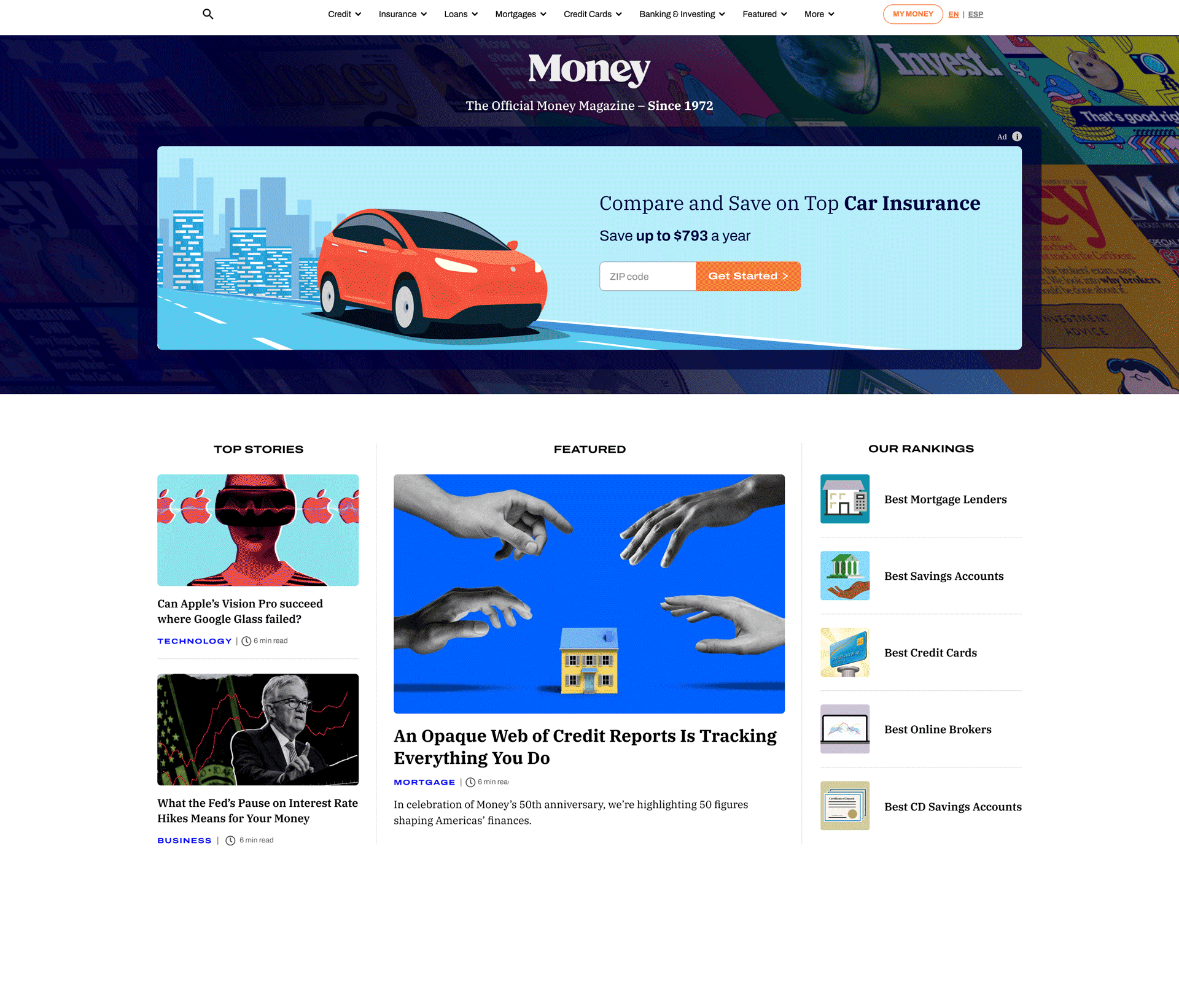
Money.com at the time of user testing

User test sample
To expedite analysis, we used ChatGPT to synthesize the research data—surfacing key pain points, success signals, and additional relevant user insights. It also helped generate initial hypotheses, which we then validated through deeper evaluation.

Chat GPT Sample
Behavioral analytics
To complement the user tests, we reviewed Microsoft Clarity session replays and scroll-depth data. The data showed a sharp 47% drop-off immediately after the fold, and click behavior was heavily concentrated in navigation—about 65% of clicks went to the top menu.
Taken together, this suggested users weren’t seeing a clear next step in the main content area. Instead, they defaulted to the menu to “figure it out,” then likely hit friction, got frustrated, and abandoned the page.

Microsoft Clarity: Clicks
47%
Dropoff
65%
Clicks to Navigation

Microsoft Clarity: Scroll Depth
Key Takeaways
1
The homepage didn’t immediately connect to the message users had just seen in the ad.
2
Users who stayed weren’t finding obvious next steps into the promoted funnels.
Hypothesis
Users arriving from TV ads were disengaging because the homepage did not clearly connect to the ad message or provide obvious next steps.
Proposed solution
Design an above-the-fold tile system that could dynamically surface multiple funnel “ads” aligned to TV messaging—without sacrificing Money’s editorial credibility or making the homepage feel like a shopping site.
Exploration & design principles
An above-the-fold tile system wasn’t new—many competitors already used above-the-fold promotional modules. The difference was execution: most competitor implementations felt overly commercial and visually overpowered the editorial brand.
We aligned on three principles:
Preserve editorial integrity: it should feel like Money, not a deal marketplace.
1
2
Make sponsorship clear: users should understand these are promotional placements, with the right disclaimers.
Scale modularly: support anywhere from 1 to 6 tiles without overwhelming the page.
3
The system
We designed a modular tile system that used our existing brand components and could flex from a single hero tile to a 6-tile grid.

Wireframe exploration
Design exploration:


To reinforce trust and brand equity, we:
Introduced a subtle background treatment featuring archival Money magazine covers to connect the digital experience to our legacy.


Added the line “The official Money magazine — since 1972” beneath the logo.
To guide attention within the layout:
Primary tiles used our illustration system to feel more editorial and visually engaging.


Secondary tiles used the icon system to stay lightweight and reduce visual noise.
Final Desktop Layout
Final Mobile Layout

Results
Once stakeholders aligned on the approach, we shipped off the designs to our dev team and launched some initial tests.
Post launch avg.
$1,725.00/day
Pre launch avg.
$937.50/day
Homepage revenue
+85%
Scaling it: building the backend
Early tests were hardcoded to move quickly. Once the approach proved successful, we needed a scalable way for internal teams to manage the tiles without engineering support.
We knew we had to create a self-serve tool that allowed non-technical users to upload, edit, and swap tiles based on market demand and partner priorities.
To support seamless team adoption, we researched self-service tools, evaluated other CMS platforms, and audited the capabilities of our existing CMS. This allowed us to design a solution that aligned with current workflows while expanding flexibility and ease of use.
Inside our CMS, we created a dedicated homepage module where users could:
-
Select the number of tiles to display (1–6)
-
Edit headline/body copy
-
Choose the appropriate CTA type (text field vs. zip flow, where relevant)
-
Upload desktop + mobile images
-
Control ordering and layout behavior with guardrails
We mapped common scenarios up front to keep the UI simple while supporting real-world complexity.

Backend white board session
High Def Backend Wireframes


Operational impact
1
Continued increase in CTR and revenue on the front end

50%
reduction in production time
by eliminating manual hardcoding and reducing engineering dependency
This work clarified the connection between user intent, messaging, and next steps on the homepage while balancing business goals and internal workflows. Grounded in user insights and designed for seamless team adoption, the solution created a more intentional experience that scales effectively across teams and sets a strong foundation for future iteration.