Money.com Newsletter Revamp
Balancing Consistency
& Uniqueness

The Challenge
Money.com’s newsletters lacked adherence to brand guidelines and were inconsistent, making it difficult to recognize them as part of the same brand. Additionally, they were not originally designed with dark mode in mind, which led to unexpected issues—off-brand colors, improperly cropped images, and poor legibility.
The Solution
To address these issues, I created a design system specifically for newsletters that ensured brand consistency while allowing each newsletter to maintain its unique identity.
Typography
I selected an email-friendly typeface that closely matched Money.com’s brand font and standardized font sizes across all newsletters for consistency.

One of many competitive research boards
Dark Mode Optimization
I avoided background colors that could be misinterpreted by dark mode email clients, preventing unintended color shifts.
Header image and disclaimer before and after
Image Handling
All images were properly cropped, and for transparent PNGs (such as logos and signatures), I added white outlines to maintain visibility in different backgrounds.

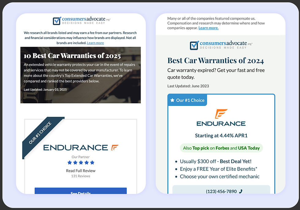
Trust Signals on cards before and after
Modular Structure
I introduced a flexible layout system with thumbnail images, small copy blurbs, and modular visual indicators (such as icons) to enhance readability and organization.

Design specifications for the dev team
Button Styling
To avoid unpredictable color changes in dark mode, I used the outline button style from Money.com’s brand system, which is typically reserved for secondary buttons.
Headers & Templates
To further differentiate each newsletter while maintaining consistency, I designed a versatile header system. For author-driven newsletters, I created a template that featured author images and unique titles, ensuring a personalized and engaging experience for readers. For general newsletters and non-author emails, I designed simplified headers with distinct background colors and the Money.com logo, reinforcing brand identity while keeping the design clean and recognizable.
In the end, this redesign resulted in a visually cohesive, brand-aligned, and dark mode-friendly newsletter system that provided a better user experience across all our email offerings.
