ConsumersAdvocate.org
Optimizing Mobile Paid Pages to Increase CTR

The Challenge
Despite multiple efforts to optimize CTR—including refining Google Ads copy, testing new keywords, and repositioning ads and widgets above the fold—performance continued to decline. After exhausting these entry-point strategies, the team shifted focus to the mobile experience, aiming to identify key UX/UI issues and opportunities for improvement.
The Solution
Conduct an in-depth analysis of competitor sites to identify user experience advantages, establish a baseline, and optimize our pages to meet or exceed industry standards.
Research & Findings
First we captured video walkthroughs and screenshots of competitor sites. These insights were compiled into a comprehensive FigJam board for quick visualization, alongside a spreadsheet with links to all outreach paid pages and competitor examples for easy reference. Given our partially remote team, we hosted an initial presentation to share findings and align on next steps before diving into design. Our analysis revealed several critical areas for improvement:

One of many competitive research boards
Header Images and Disclaimer
While our default template included a standard header image, competitors prioritized clear, legible introductory copy by omitting it. Removing the image and setting a recommended character count improved readability and pushed more content above the fold.
Additionally, the default disclaimer, placed below the logo and above the H1, disrupted the reading flow. Moving it above the logo on a white background created a smoother, more engaging experience.
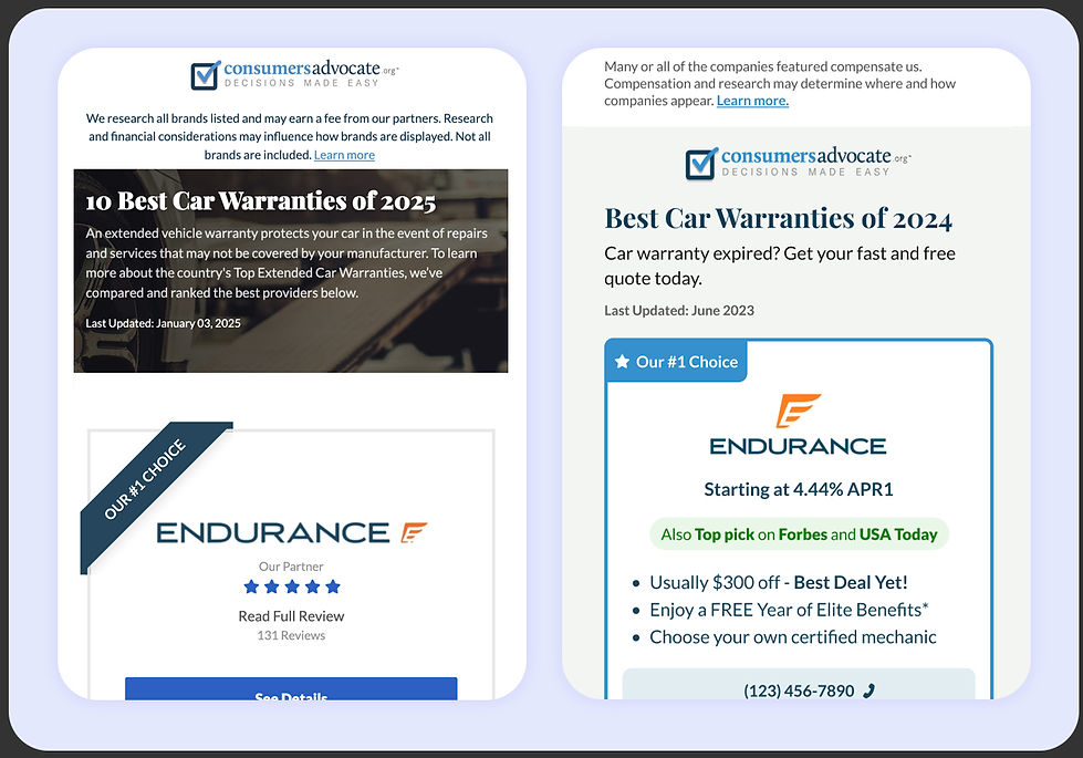
Header image and disclaimer before and after
Trust Signals
Competitor pages consistently featured prominent trust indicators, such as rating systems and credibility markers, to build confidence among users. Ours we muted, barely visible, so we made sure to enhance them and include a ratings system.

Trust Signals on cards before and after
Typography and Card Design
Our typography and card layout needed improvements for readability, accessibility, and visual clarity. The font size was too small, buttons were undersized and lacked prominence, and company cards blended together due to insufficient spacing. Additionally, excessive bullet points made scanning difficult, while the rigid, square-shaped cards felt outdated. To enhance usability, we increased the copy size to meet accessibility standards, introduced an 8pt corner radius, and improved spacing—creating a cleaner, more modern, and visually appealing layout.

Design specifications for the dev team
Implementation & Results
Using these insights, and with just a few simple adjustments here and there, we developed design improvements to enhance user experience and engagement. After refining our proposals, we secured stakeholder buy-in and moved forward with implementation.
To support ongoing optimizations, the development team built a self-serve platform, allowing marketing to adjust landing pages independently. We then conducted iterative A/B tests, fine-tuning elements like button size, spacing, and layout while tracking performance.
Our efforts led to a 3% increase in CTR—not the breakthrough we aimed for, but a crucial step in stabilizing performance and building a foundation for continuous improvement. Each iteration has helped refine the experience and drive engagement forward.
