The Four One One
Turning editorial truth into a brand system.
Designing a flexible brand for ConsumersAdvocate’s editorial initiative, within a CMS-based blog and limited resources.
My Role
Brand, Illustration, Product Design
Tools
WordPress, HTML & CSS
The Four One One brand shown on a laptop
The project at a glance
An editorial initiative that needed a distinct, trustworthy brand.
The Product
The FourOneOne
An editorial brand by ConsumersAdvocate.org that surfaces honest, unfiltered insights across industries and product categories.
The Users
Consumers
Readers looking for direct, truthful information, arriving from the ConsumersAdvocate ecosystem.
My Focus
Brand + illustration
Brand discovery, logo and color, the WordPress theme and homepage, illustration, infographics, and engagement.
Why build a brand?
The opportunity: a flexible brand system that could authentically communicate editorial truth while adapting to real CMS and resource constraints.
The initiative
Packaging what the team learned
The FourOneOne was an editorial initiative by ConsumersAdvocate.org designed to surface honest, unfiltered insights across industries and product categories. As the team uncovered recurring consumer pain points, they identified an opportunity to package this knowledge into a distinct, trustworthy brand.
The challenge
Editorial integrity, at scale
I partnered with the team to define and design the brand system from the ground up. The challenge was to translate editorial integrity into a recognizable, scalable brand while working within limited resources and a CMS-based blog platform—one that could communicate credibility, clarity, and confidence without feeling institutional or overproduced.
Finding the meaning behind “411”
Collaborative exercises turned “411” into a shared set of brand attributes.
Meaning & personality
We began by unpacking the meaning behind “411” as shorthand for direct, truthful information. Through collaborative exercises, we translated that concept into a shared set of brand attributes—helpful, authentic, human, and empowering—which became the foundation for all design decisions.
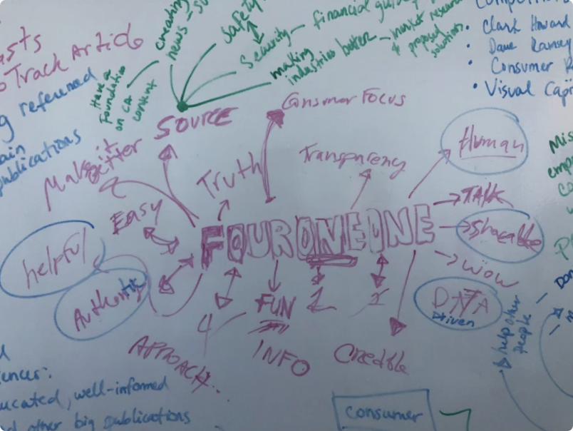
Brand meaning and personality exercise
Visual exploration
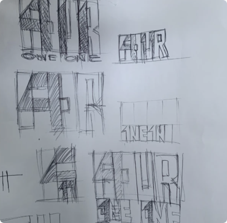
With the brand attributes defined, I explored visual directions that could embody those values. Early sketches focused on clarity, restraint, and confidence, allowing the concept—not ornamentation—to lead. These explorations were refined into a small set of high-fidelity directions for evaluation.

Early visual explorations
High-fidelity directions
One direction stood out
Bold use of space, with meaning embedded subtly in the form.
Final selection
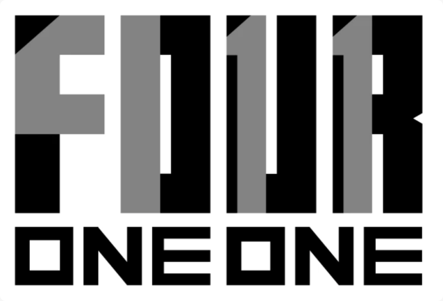
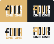
One direction stood out for its bold use of space and its ability to embed meaning subtly within the form. The design echoed the idea of “reading between the lines” while remaining flexible enough to function both as a logo and a modular brand mark.
Selected logo direction
Selected logo in context
Refinement
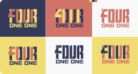
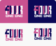
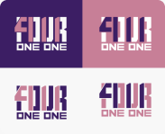
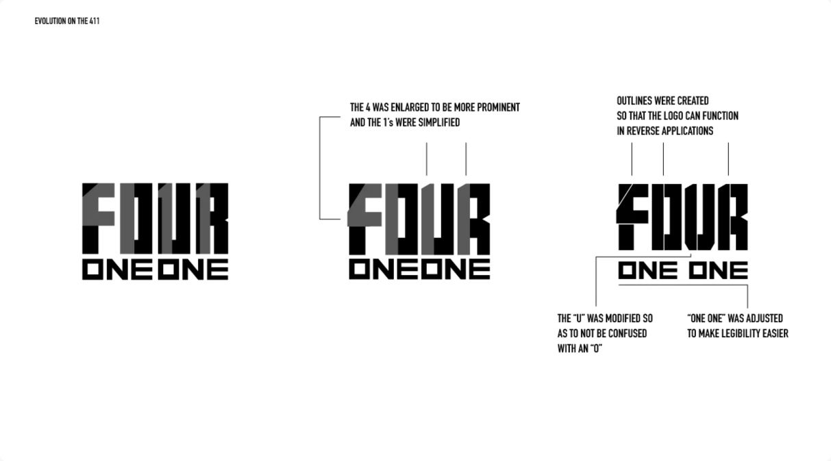
The logo was refined to surface the “411” without making it overt. This was achieved through careful spacing and color contrast.
Logo evolution and refinement notes
Color
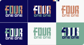
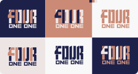
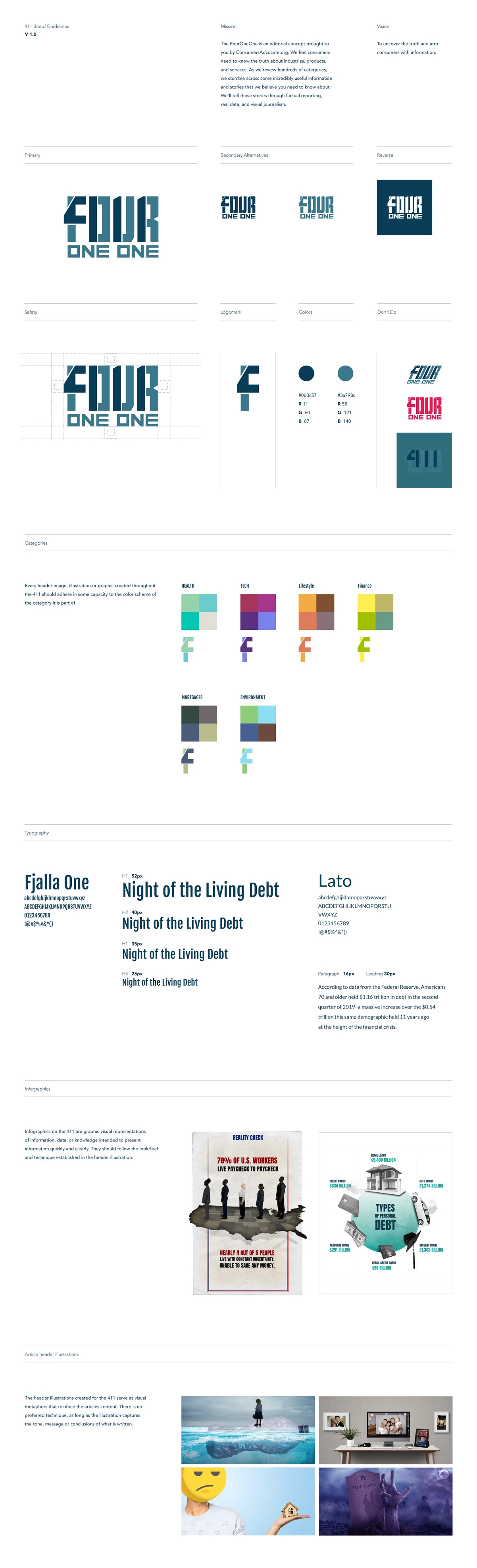
Anchored in ConsumersAdvocate’s primary blue, paired with a lighter tone to reinforce trust, experience, and continuity.
Brand color swatch
Brand color swatch
Brand color swatch
Brand color swatch
Brand color swatch
Brand color swatch
Logo in the brand palette
Brand guide
The Four One One brand guide
Website
WordPress was selected early as the CMS, with limited resources for custom templates.
A flexible theme
Rather than forcing complexity, I selected a flexible theme that offered multiple article layouts. The homepage required additional refinement, so I selectively modified the existing template with lightweight HTML and CSS to surface more content above the fold and prioritize discoverability.
A minimal interface
The interface was intentionally minimal. Brand colors were used sparingly, and buttons were visually restrained to avoid interrupting the reading experience. Interaction states provided clarity without distraction, reinforcing a calm, content-first environment.
The Four One One homepage
Content that extends the brand
Visual extensions of the content—metaphors rather than decoration.
Illustrations and infographics
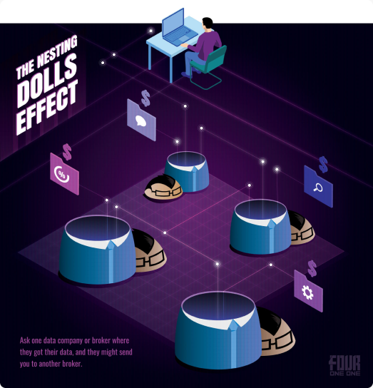
Illustrations and infographics acted as visual extensions of the content—serving as metaphors rather than decoration. While styles varied, consistency was maintained through tone and intent, ensuring flexibility for future contributors without diluting the brand system.
Infographic illustrations
Accessibility and SEO
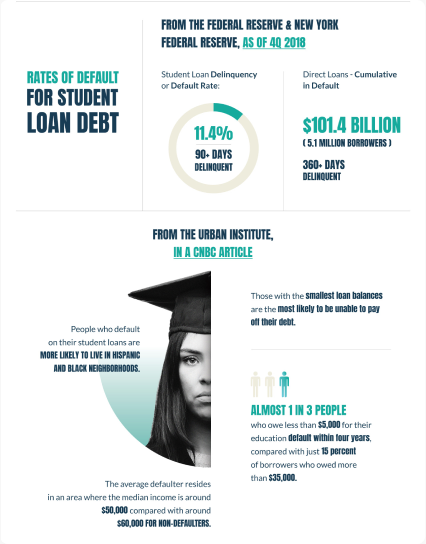
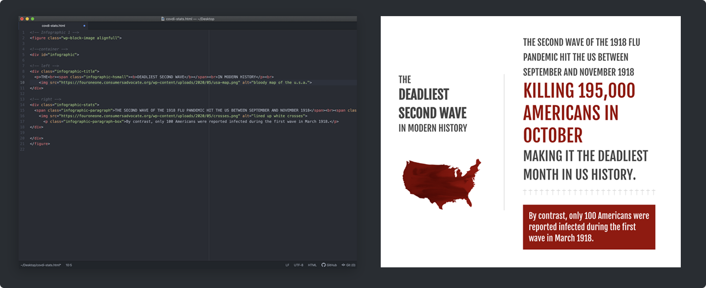
To ensure accessibility and search visibility, infographics were built using HTML and CSS rather than static images. This approach allowed content to be indexed by search engines and interpreted by screen readers, reinforcing the brand’s commitment to clarity and inclusivity.
Infographic built with HTML and CSS
Engagement
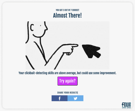
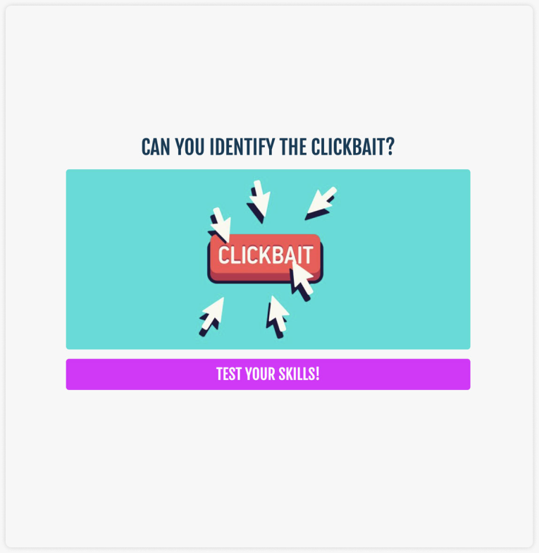
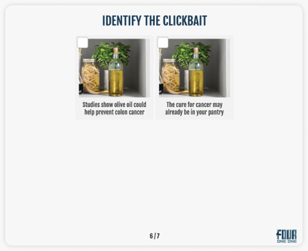
To increase time on page and encourage exploration, interactive elements such as animations and quizzes were introduced. These tools supported engagement without competing with the editorial content, reinforcing learning through participation.
Interactive quiz
Animation and interaction
Results & impact
A distinct editorial brand, launched within the ConsumersAdvocate ecosystem.

The FourOneOne successfully launched as a distinct editorial brand within the ConsumersAdvocate ecosystem. The platform attracted a steady flow of visitors from ConsumersAdvocate, validating the brand’s ability to extend trust and curiosity beyond the parent site.

The flexible brand and content system enabled consistent publishing, supported SEO and accessibility best practices, and provided a foundation that could scale with minimal ongoing design effort.

As organizational priorities evolved, the company ultimately shifted focus in a different strategic direction, and the initiative was sunset—leaving behind a well-defined brand system and a strong proof of concept.

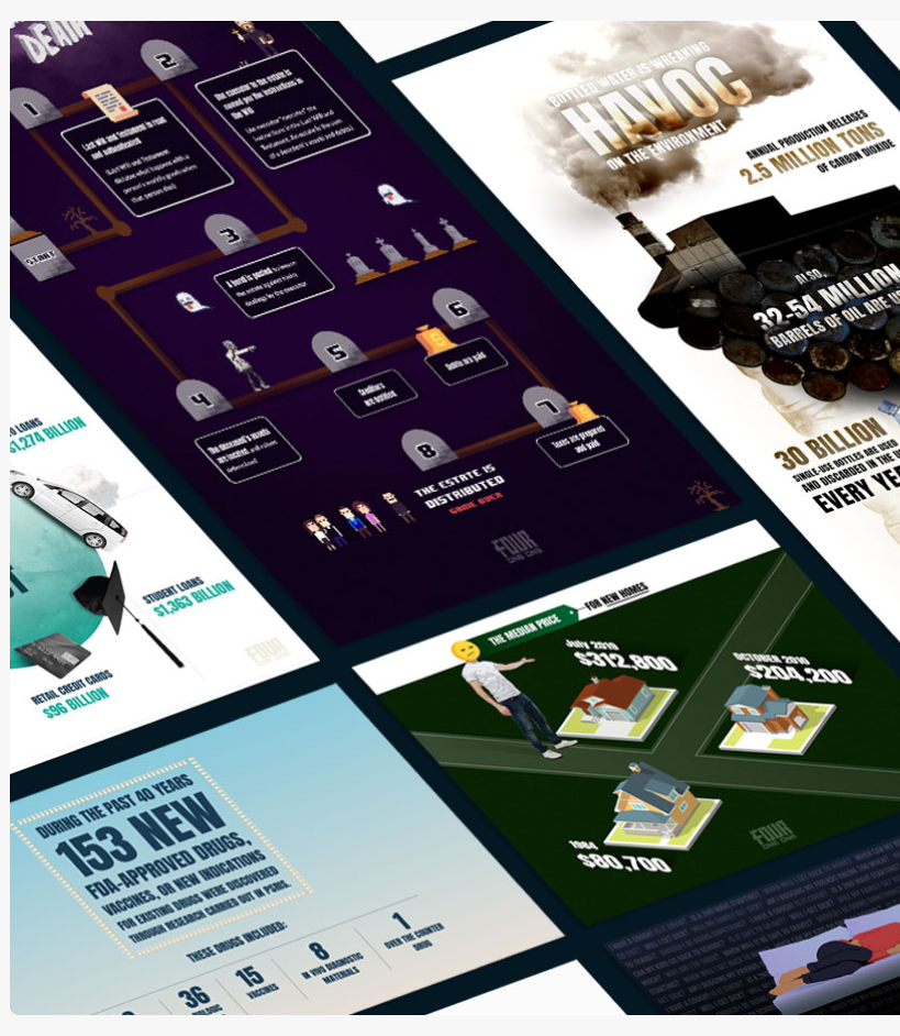
Infographics created for The Four One One
Learnings
Building The FourOneOne clarified the importance of anchoring brand expression in a clear point of view. Strong conceptual foundations allowed the brand to scale across logo, UI, illustration, and content—even within tight CMS constraints—proving that thoughtful systems can create impact without heavy customization.
José Vélez | Product Design Lead
HomeCase StudiesThe Four One One

Turning editorial truth into a brand system.

Designing a flexible brand for ConsumersAdvocate’s editorial initiative, within a CMS-based blog and limited resources.

My RoleBrand, Illustration, Product Design
ToolsWordPress, HTML & CSS

The project at a glance

An editorial initiative that needed a distinct, trustworthy brand.

The Product
The FourOneOne
An editorial brand by ConsumersAdvocate.org that surfaces honest, unfiltered insights across industries and product categories.
The Users
Consumers
Readers looking for direct, truthful information, arriving from the ConsumersAdvocate ecosystem.
My Focus
Brand + illustration
Brand discovery, logo and color, the WordPress theme and homepage, illustration, infographics, and engagement.

Why build a brand?

The opportunity: a flexible brand system that could authentically communicate editorial truth while adapting to real CMS and resource constraints.

The initiative
Packaging what the team learned
The FourOneOne was an editorial initiative by ConsumersAdvocate.org designed to surface honest, unfiltered insights across industries and product categories. As the team uncovered recurring consumer pain points, they identified an opportunity to package this knowledge into a distinct, trustworthy brand.
The challenge
Editorial integrity, at scale
I partnered with the team to define and design the brand system from the ground up. The challenge was to translate editorial integrity into a recognizable, scalable brand while working within limited resources and a CMS-based blog platform—one that could communicate credibility, clarity, and confidence without feeling institutional or overproduced.

Finding the meaning behind “411”

Collaborative exercises turned “411” into a shared set of brand attributes.

Meaning & personality

We began by unpacking the meaning behind “411” as shorthand for direct, truthful information. Through collaborative exercises, we translated that concept into a shared set of brand attributes—helpful, authentic, human, and empowering—which became the foundation for all design decisions.

Visual exploration

With the brand attributes defined, I explored visual directions that could embody those values. Early sketches focused on clarity, restraint, and confidence, allowing the concept—not ornamentation—to lead. These explorations were refined into a small set of high-fidelity directions for evaluation.

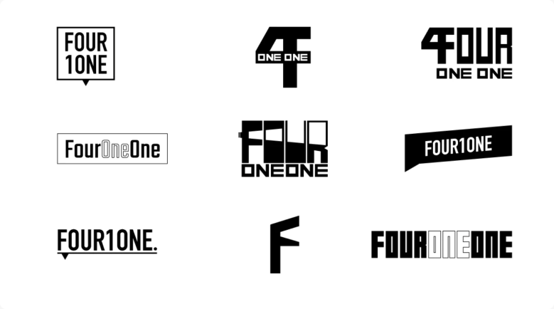
One direction stood out

Bold use of space, with meaning embedded subtly in the form.

Final selection

One direction stood out for its bold use of space and its ability to embed meaning subtly within the form. The design echoed the idea of “reading between the lines” while remaining flexible enough to function both as a logo and a modular brand mark.
Refinement

The logo was refined to surface the “411” without making it overt. This was achieved through careful spacing and color contrast.
Color

Anchored in ConsumersAdvocate’s primary blue, paired with a lighter tone to reinforce trust, experience, and continuity.
Brand guide
Website

WordPress was selected early as the CMS, with limited resources for custom templates.

A flexible theme

Rather than forcing complexity, I selected a flexible theme that offered multiple article layouts. The homepage required additional refinement, so I selectively modified the existing template with lightweight HTML and CSS to surface more content above the fold and prioritize discoverability.

A minimal interface

The interface was intentionally minimal. Brand colors were used sparingly, and buttons were visually restrained to avoid interrupting the reading experience. Interaction states provided clarity without distraction, reinforcing a calm, content-first environment.

Content that extends the brand

Visual extensions of the content—metaphors rather than decoration.

Illustrations and infographics

Illustrations and infographics acted as visual extensions of the content—serving as metaphors rather than decoration. While styles varied, consistency was maintained through tone and intent, ensuring flexibility for future contributors without diluting the brand system.
Accessibility and SEO

To ensure accessibility and search visibility, infographics were built using HTML and CSS rather than static images. This approach allowed content to be indexed by search engines and interpreted by screen readers, reinforcing the brand’s commitment to clarity and inclusivity.
Engagement

To increase time on page and encourage exploration, interactive elements such as animations and quizzes were introduced. These tools supported engagement without competing with the editorial content, reinforcing learning through participation.
Results & impact

A distinct editorial brand, launched within the ConsumersAdvocate ecosystem.

The FourOneOne successfully launched as a distinct editorial brand within the ConsumersAdvocate ecosystem. The platform attracted a steady flow of visitors from ConsumersAdvocate, validating the brand’s ability to extend trust and curiosity beyond the parent site.

The flexible brand and content system enabled consistent publishing, supported SEO and accessibility best practices, and provided a foundation that could scale with minimal ongoing design effort.

As organizational priorities evolved, the company ultimately shifted focus in a different strategic direction, and the initiative was sunset—leaving behind a well-defined brand system and a strong proof of concept.
Learnings
Building The FourOneOne clarified the importance of anchoring brand expression in a clear point of view. Strong conceptual foundations allowed the brand to scale across logo, UI, illustration, and content—even within tight CMS constraints—proving that thoughtful systems can create impact without heavy customization.